The Cides
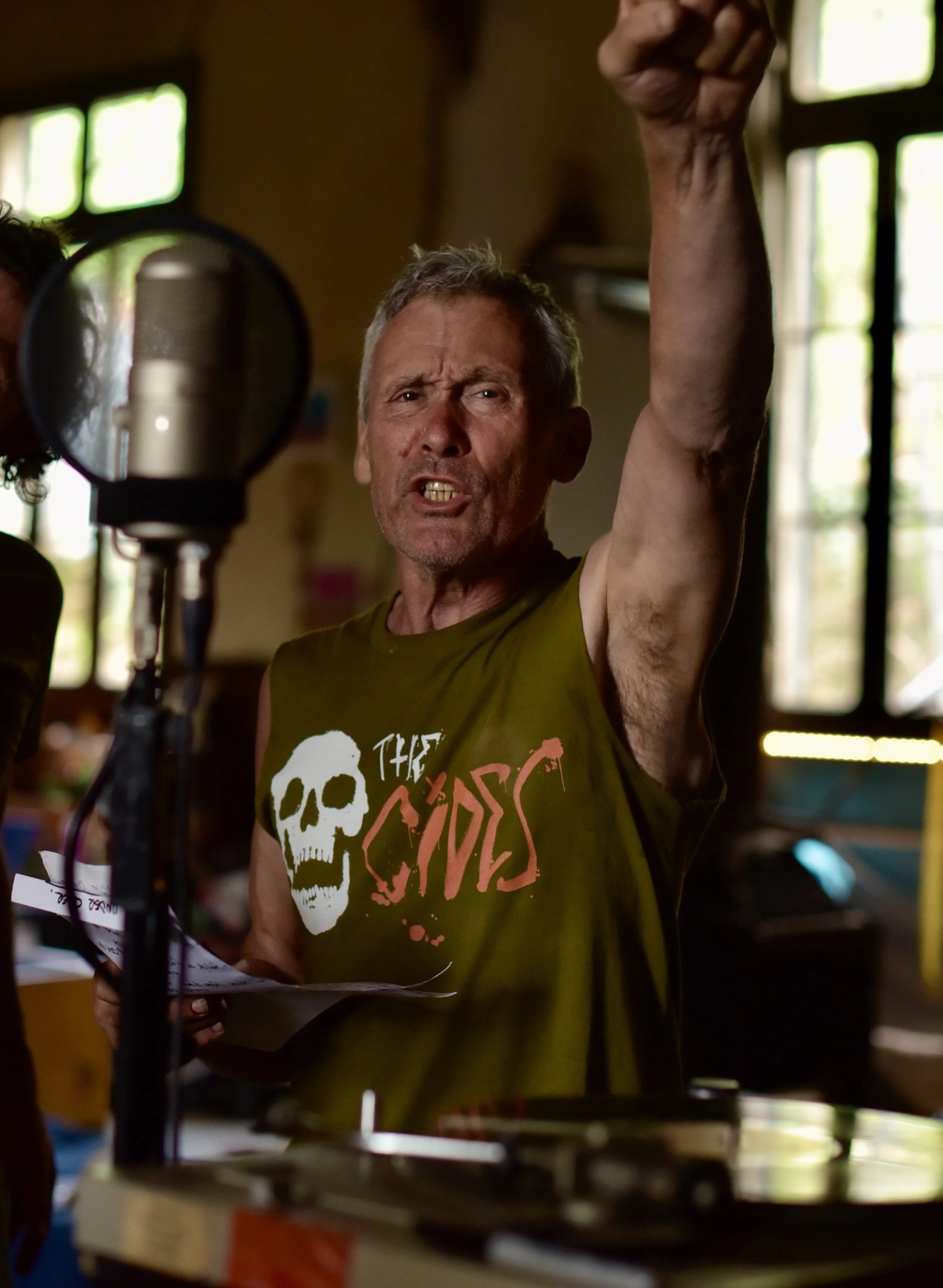
The Cides delivers songs about life and death, sex and love and they raise awareness of social injustice and inequality. Personally, I think the band’s name is inspired. Words that end in ‘cide’ all concern death, destruction, extermination and deliberate killing, such as suicide, homicide, genocide, pesticide and fungicide. All the things the band are bringing attention to in their songs.
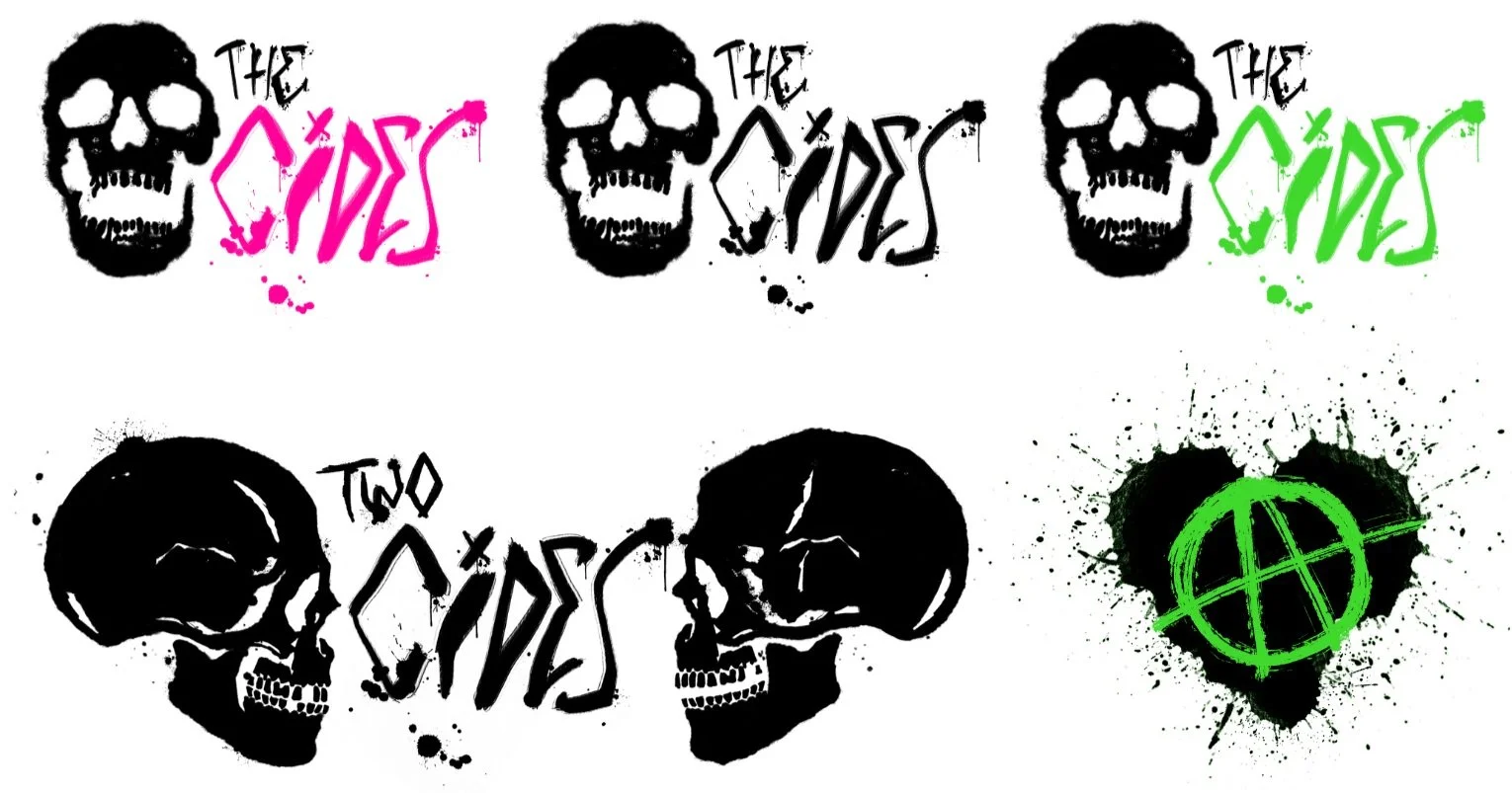
The founder Paul is the former co-founder of The Molesters back in the days of original punk. We have created a blog page called Two Cides (as in there are 2 sides to every story). Glen created the logo, using lettering that had already been created by Paul’s friend Melina. Glen strengthened the lettering up and introduced the skull (now known as Ebenezer, the band’s mascot). He has also created the cover artwork for the songs. It’s been a wonderful opportunity to use strong fluorescent colours and bold typography. I love the ripped up feel of punk design, it has an immediate impact and is the opposite of sleek and slick.
I do all of the bands press releases, newsletters and l look after their Instagram, Facebook, Twitter and Gab accounts. I’m also creative director on their videos.

LOGOS
Glen created a full set of logo assets for The Cides including an animated GIF of Ebenezer, the bands mascot.
The Two Cides (as in every story has 2 sides) logo heads up their articles and research page. Glen also designed an anarchy and love icon for them.
“Caroline is one in a thousand. She works to the highest standards, delivering on time and in budget. Nothing is too much trouble. I don’t want to say too much for fear of losing her to new customers. I can’t recommend her highly enough.”


